To stay trendy and relevant it is common for companies to go through several rebrands during their lifetime. VMRD is no different however, we have only gone through one major rebrand, with little tweaks thrown in occasionally. We don’t update our design to keep up with trends, but simply to stay fresh and interesting. If anything, I’d consider VMRD to exist outside of the trend. Let’s take a look at VMRD’s logo over the years.
80s opulence. In a time of new-wave styles like Memphis Milano, Neon Noir, and ‘80s Deco, VMRD kept it simple. No crazy patterns, bright neon colors, or palm trees, just a bold-colored, slanted sans-serif font, and a diamond-shaped graphic.
.png)
In many ways, VMRD was ahead of the design curve. Dare I say “avant-garde”?
By the EXTREME 90s, this logo would end up fitting right in with the punchy, “brutalist” typography that became trendy, but would differ greatly in its continued simplicity. Brands were still clinging to the bright and brash aesthetics of the 80s but adding in goofy, nonsensical shapes and paint splotches for dramatic effect. As a result, design got hectic and unpleasant. VMRD remained in their lane, almost fitting right in with the “anti-design” trend of the 90s. Almost.
The digital age of the 00s created a conflict of ideas: brands wanted to rebel against the 90s lack of subtlety and return to bright, colorful graphics, but they also needed to adopt designs that were simplified, and suitable to the new digital environment. This new digital playground gave brands a broader reach and expanded audience, which prompted many brands to reevaluate their identity, VMRD included.
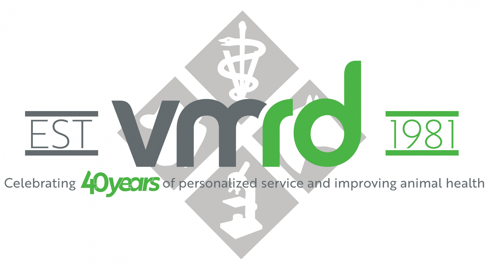
In 2012 VMRD decided it was time to move forward with a new logo and brand identity. The new logo conveyed not only adoption of the future, but in many ways captured the spirit of VMRD in a way the old logo couldn’t. The color scheme presents a less assertive, calmer, and trusting aesthetic. The typography moved to a humbler, more casual style, which is indicative of our approach to company culture and customer service.
![]()
In adapting to a digital world, branding has continued to evolve into a simpler, cleaner format. Even with this simplicity, there seems to be a revitalized trend of being “retro”. Brands are now revisiting their style from the 80s and 90s, hoping to tap into our nostalgia to stay relevant.
With everybody going retro now, have no fears, VMRD is still going to exist outside of trend. We will not be jumping on the retro bandwagon. Instead, we choose a celebration of where we were and where we are. Enter the anniversary logo, a blend of old and new, without compromising the brand identity we’ve worked so hard to maintain.